We are living in a one-click world where everything is digital. Your website can give people a first impression. It is your very own virtual storefront. It is your online business card that will show. An elevator, pitched all rolled into one. If you’re a small business owner, a professional-looking website is important to have. It is no longer only for established companies but also for start-ups. Don’t get yourself confused by fancy graphics or flashy kinds of animations. It’s not what your site totally professional.
In this blog, we will share the different essential elements to make your site professional and credible.
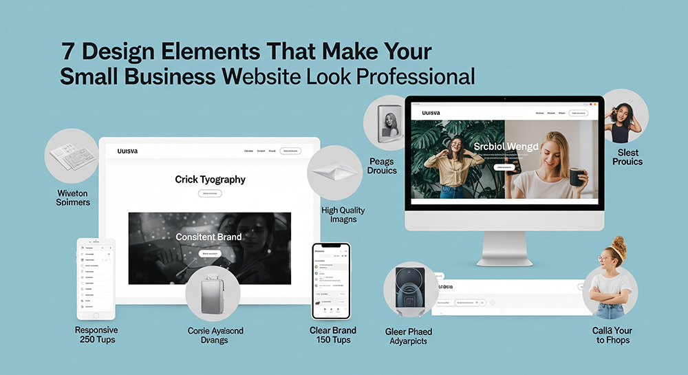
1. Clean, Consistent Brand
Your visual identity is shown through branding. That’s how it works for many nowadays. It is the driving force of your business. There are different competitors showcasing themselves online, and how do you stand out from the crowd? You need a well-branded and consistent website among the rest. Give your visitors a sense of confidence that you are legitimate and not fake.
What makes good branding?
- A clear logo in the header and favicon
- A consistent color palette is used throughout the site
- Easy-to-read typography (no more than 2-3 fonts!)
- A defined tone or “vibe” that matches your business personality
Did you know that when you are branding your website, you are also creating familiarity? Starting from your social media, email marketing, to your website. They must all belong to the same brand. No alter ego to your potential customers. Be as authentic as you can. Stick to 2–3 brand colors max. Use one dominant color, one accent color, and a neutral background color to keep it clean and elegant.
2. A Clear and Intuitive Navigation Bar
Do you get upset whenever the website you are opening is so difficult to understand? You can’t find the services or the contact details. That’s a very red flag already. You don’t want to be them. The navigation menu must be easy to find. It should be obvious where and quick to click. Users should be able to explore your site without a headache.
Key best practices:
- Keep the menu at the top (sticky is even better!)
- Limit top-level items to 5–7 (think: Home, About, Services, Contact, Blog)
- Do not use jargon or slang words. If your target audience is from different parts of the world, keep the English basic.
- Make sure you have a section page for “Call to Action, “Get a Quote”, or “Book Now” to make it easy for your visitor to reach out to you.
Remember: good navigation helps people and search engines understand what your site is all about.
3. Mobile-First Responsive Design
Here’s something you need to internalise. Most of the website traffic is coming from mobile devices. Meaning to say, if your site isn’t optimized for smartphones and tablets, you miss. Let’s talk about being responsive to your design. Just keep in mind that it must automatically adapt to whatever kind of screen size your visitor is using.
Check the following:
- Text that’s easy to read on small screens
- Buttons that are large enough to tap
- Images that resize properly without distortion
- No horizontal scrolling (a common mistake)
Google also ranks mobile-friendly websites higher, so this isn’t just about user experience. It’s about SEO too.
4. High-Quality Images (And Consistent Visuals)
Stock photos might be convenient, but if they scream “generic,” your site won’t stand out. Visuals are the first thing people notice, and low-quality or mismatched imagery can kill your credibility fast.
Use images that:
- Are high-resolution and web-optimized (compressed for speed)
- Represent your actual team, product, or workspace if possible
- Match your visuals to your brand tone
Don’t forget the illustrations, icons, or graphics you are using. They should be of the same style color scheme from the start. Invest in a professional brand photoshoot. It pays off in spades for your website, social media, and marketing materials.
5. Clear Calls-to-Action (CTAs)
What do you want your visitor to do next? Buy something? Book a service? Fill out a form? Call you? A website without clear CTAs is like a conversation that ends with an awkward silence. You need to guide users with visually prominent, compelling calls to action.
Effective CTAs should be:
- Clear and action-oriented (“Schedule Your Free Consultation”)
- Easy to find (above the fold and at logical points throughout the page)
- Designed to stand out (use contrasting buttons)
Place them in your hero section, at the end of content blocks, and definitely on every service or product page. Don’t overdo it, one strong CTA per page is often more effective than several confusing ones.
6. Trust-Building Elements (Social Proof)
No matter how great your product or service is, new visitors need proof. That’s where trust elements come in. These are subtle signals that show you’re the real deal.
Add these to look more credible:
- Customer testimonials or case studies
- Client logos or partner badges
- Certifications, awards, or accreditations
- Links to Google reviews or Trustpilot
- Secure site indicators (SSL certificate, HTTPS, etc.)
People want to know they’re not the first ones doing business with you. Use trust elements to eliminate doubt and build confidence.
7. Fast Load Times and Simple Layout
Here’s the deal: A beautiful website that loads slowly? Useless. Speed is a huge part of perceived professionalism. If it takes 3 seconds or more for your site to load, don’t expect your visitors to stay. They’ll obviously look for another want.
How to speed things up:
- Compress all images
- Minimize the use of heavy animations or videos
- Use caching plugins or CDNs
- Choose a fast, reliable hosting provider
Equally important is the simplicity of your layout. Don’t try to jam everything into one page. Use white space, break up content into sections, and give your visitors breathing room. Clean, fast, and functional = professional.
Bonus: A Modern Footer with All the Essentials
Don’t neglect your footer! It might be at the bottom, but it’s one of the most visited parts of any website.
Include:
- Contact info (address, email, phone)
- Navigation links
- Social media icons
- Business hours (if relevant)
- A link to your privacy policy or terms of use
A professional footer tells visitors that your site and your business are complete and trustworthy.
Conclusion
If you are a small-business owner, the key to growing your brand is by creating a professional-looking website. You don’t have to purchase the most expensive tools or the most trending design. Focus on having clarity, consistency, and customer trust. All of these will guarantee you a fruitful result to harvest. The goal is not only to appear professional but also to be trustworthy and user-friendly. These are powerful tips for your website growth. It doesn’t matter whether you are doing it all by yourself or with a web designer; keep these principles. Your small business will grow through time, just trust the process.