Simple and Powerful
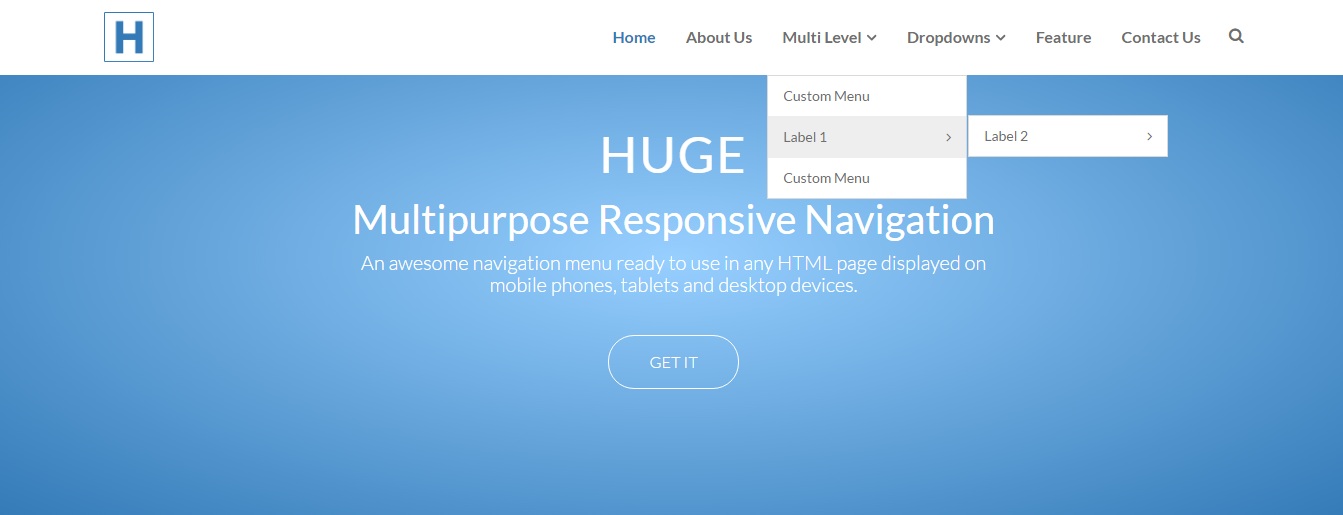
"HUGE Navigation" was made to be simple, beautiful, simplistic and powerful. It was created carefully to work in any device, from mobile phones to any other devices like laptop, desktop, mac operationg system.
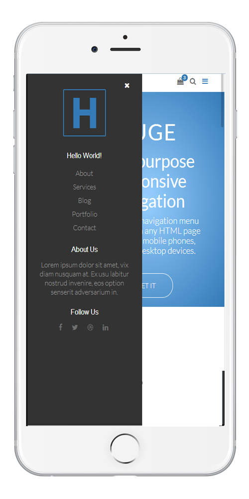
The Huge Navigation menu has a lot of features.
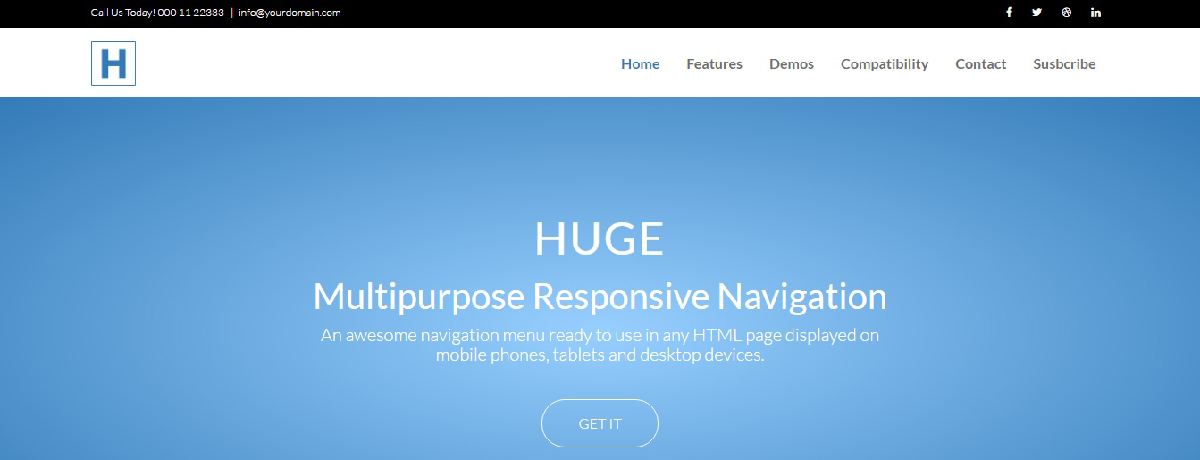
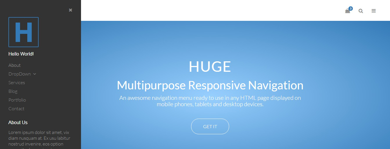
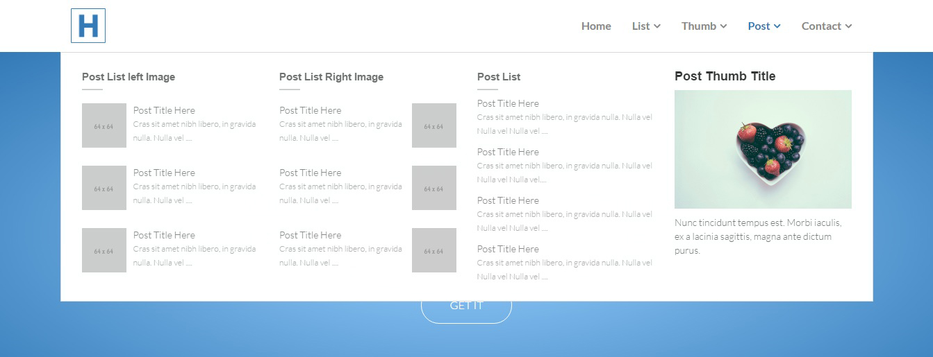
Almost all types of menu style you able to build using Huge Navigation.
A responsive navigation ready to fit perfectly on mobile phones, tablets and desktop devices.
HUGE - Responsive nav menu comes with a set of pre-built skins ready to use. No need to worry to design a new menu anymore.
Crafted with HTML5 and CSS3 according with the latest web patterns and best practices.
Compatible with the major browsers like Chrome, Firefox, Safari, Opera, IE and Edge.
Compatible with the most famous front-end framework in the world: Bootstrap.
High level documentation teaching you to build the navigation step by step.
"HUGE Navigation" was made to be simple, beautiful, simplistic and powerful. It was created carefully to work in any device, from mobile phones to any other devices like laptop, desktop, mac operationg system.
We have a lot of pre built examples & you can get all of them in the download file.
No more pain to style your navigation menu.
Huge navigation is built using very latest coding standard.
It's support all of the most modern browsers, also in older versions.
Or have any question, or just want to say hello. No matter your need, we are here to help you.